This tutorial provides a basic overview of how to assess and interpret potential climate changes using the tools provided within the Regional Climate Change Viewer (RCCV). The example is for Deschutes County, Oregon, but the techniques are applicable to other counties or hydrological units in the RCCV. In order to gain the most out of this tutorial, we recommend that you open the RCCV in a separate tab/window to follow along with the step-by-step guide. You can do that by clicking here: Open RCCV in a new tab. If you are unfamiliar with the RCCV application, please read the RCCV Tutorial before beginning.
Step 1: Choose a State and County
Now that you have the RCCV open, choose a county to analyze. Click on the state of Oregon on the national map, then place the arrow over Deschutes County on the Oregon map and click:
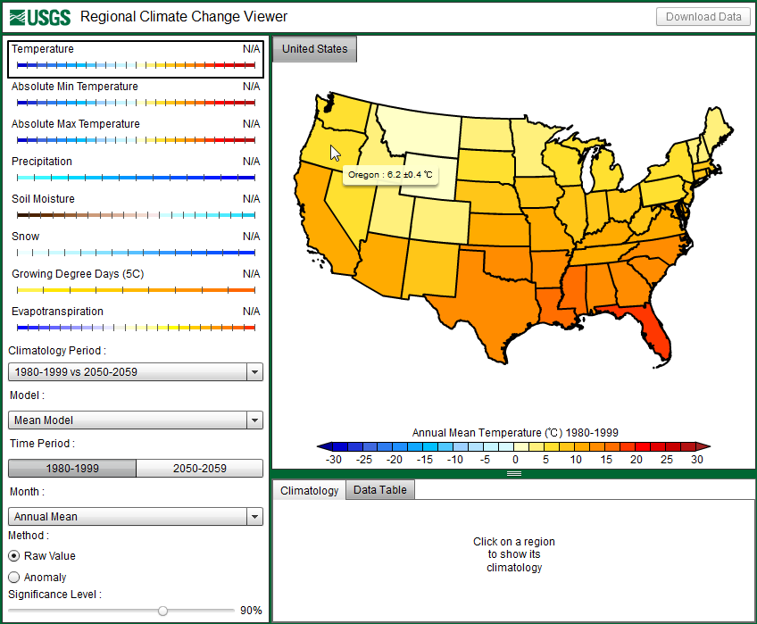
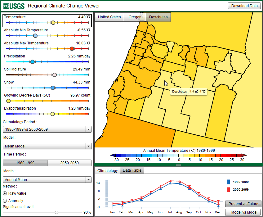
The RCCV should now look like the image above. The tabs at the top of the map indicate the active state and county for which you are viewing climate data. Note that for this tutorial, as well as for Climatology 201, “Mean Model” is selected in the left panel, which indicates that the data displayed are the averages or means of data from all three models. We will explore the differences between models in Climatology 301.
Step 2: What do the data tell you?
The panel on the left displays the annual mean value for each of the listed climate variables. This value represents the climatological mean for the given time period: either the default base climatological period (1980-1999) or a chosen future decade (here 2050-2059, as displayed above). In the figure above the annual mean temperature for Deschutes County is 4.4°C, the annual mean precipitation is 2.26 mm/day, and so on. Because temperature is selected in the left panel (as indicated with a black box), the annual mean temperatures for each county are displayed on the map and correspond to the colorbar below the map, allowing you to compare the annual mean value for Deschutes County with other counties in Oregon. It is apparent from the map that Deschutes County, along with other counties in central Oregon, is generally cooler than counties on the west side of the Cascade Range mountains. You may see the temperature values for other counties by hovering your mouse cursor over a county of interest.
Experiment by clicking on different variables in the left-hand panel and see how the map changes. Is the annual precipitation in Deschutes County higher or lower than in surrounding counties? What about snow?
Select “Temperature” again in the left panel. The graph below the map shows the monthly average temperatures or the annual cycle for the selected county for both present (blue line) and future (red line) time periods. We will focus on the difference between these two lines in the next step. Hovering over each point on the graph will display the mean temperature for that month:
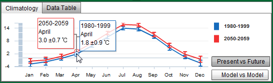
The small vertical error bars displayed at each point show the standard deviations of the monthly average values. The standard deviation is a measure of how much spread or variance there is around the average: a smaller standard deviation value indicates that the values in a data set used to calculate the average are similar or close together, and a larger standard deviation indicates that the values in a data set used to calculate the average are more different. Because we are viewing the “model mean” values, the error bars represent the standard deviation of the values from each model that were combined to make up the mean value displayed here. In general, the smaller the error bar, the smaller the standard deviation, which means the year-to-year temperatures are more similar within the time period (e.g., 1980-1999 or 2050-2059, etc.). The standard deviation value is also displayed when hovering over each point, as shown above, or when hovering over a region on the map. For the 1980-1999 April temperature, the mean value is 1.8°C with a standard deviation of ±0.9°C. The interpretation of the mean value and the standard deviation is that 2/3rds or 67% of the 10 monthly values for April temperatures fall within the range of 0.9°C to 2.7°C. Clicking on a month will change the values in the left-hand panel and also the values displayed on the map.
Step 3: Climate Anomalies: How might the climate change in the future?
As shown above, the average April temperature for Deschutes County for the 1980-1999 base period is 1.8°C. For the future decade of 2050-2059, the average April temperature is 3.0°C. Thus, the three climate model simulations used here project that the mean April temperature for Deschutes County will increase ~1.2°C in the next 50-60 years.
Now, click on “Snow” in the left-hand panel. The “Snow” value represents the annual average amount of water stored in the snowpack, known as snow water equivalent (SWE). The map and climatology graph should change accordingly to display these values that are simulated by the climate models for Deschutes County:
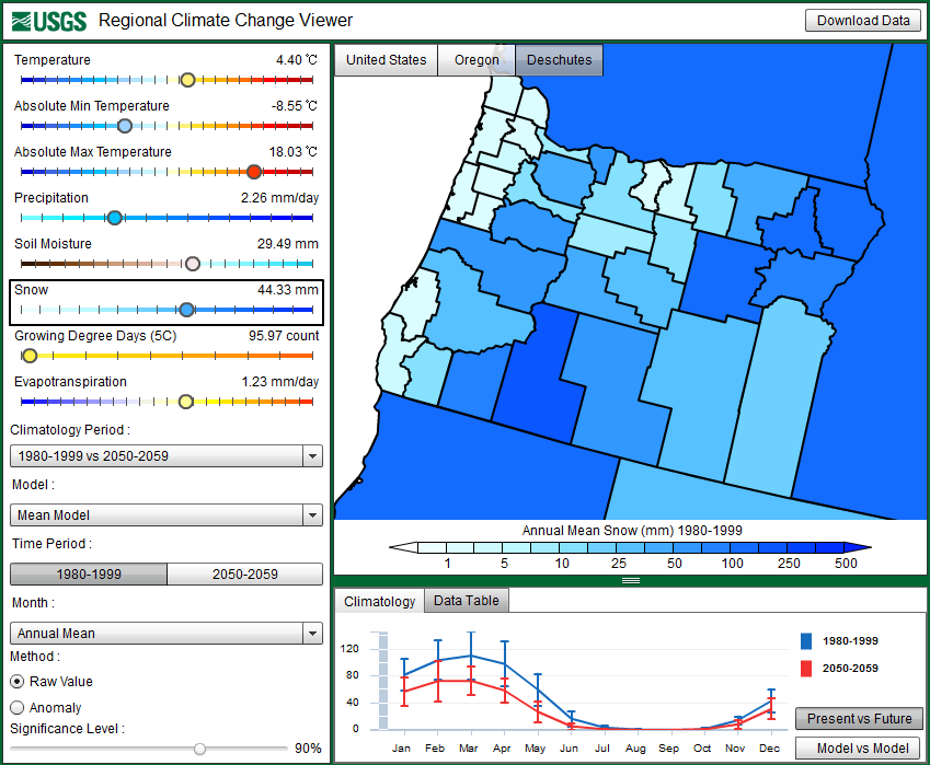
The climatology graph now shows the average monthly SWE for Deschutes County. Deschutes County has a large elevation range. Rainfall tends to increase substantially with elevation, whereas air temperature tends to decreases with elevation, resulting in greater snowfall or SWE at higher elevations, but that spatial detail is lost by averaging over the entire county. The greatest snowfall occurs in the winter and early spring, and there is considerable year-to-year variability as indicated by the standard deviations of the monthly averages. Notice the difference between the values for the present versus the future:
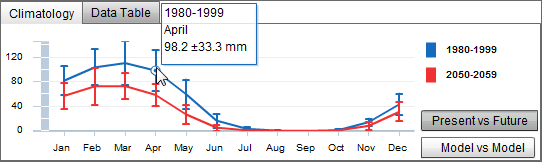
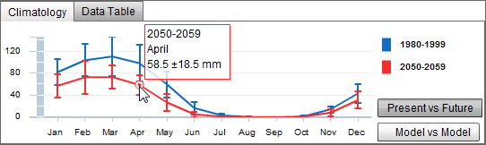
The future SWE values are less than the present values: 1980–1999 average April SWE is 98.2 mm compared to 58.5 mm in April 2050–2059, a decrease in SWE amounting to nearly 40 mm.
The changes in air temperature and SWE that we explored above are called climate “anomalies”, which we define here as the difference between a possible future value (i.e., 2050-2059) and the present or base-line value (i.e., 1980-1999). To save the time of calculating each climate anomaly and to readily see how different the future might be from the present, the RCCV allows you to display the anomaly instead of the raw value by clicking on “Anomaly” on the lower left-hand panel:
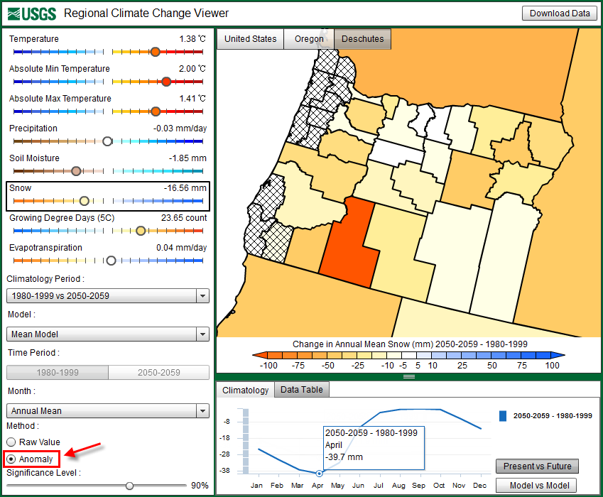
The values on the left panel, the map, and the climatology graph will all change accordingly to display the anomalies between a chosen future time period (we’ve been working with 2050-2059) and the present base period (1980-1999). You can change the future decade under “Climatology Period” on the left panel, but for this example we will use 2050-2059. Looking at the climatology graph for SWE, you can see that Deschutes County could experience a decrease in SWE for every month that there is snow on the ground. Hovering the mouse cursor over April reveals the approximate -40 mm anomaly we calculated earlier. It appears that SWE could become more variable during late winter and spring, which is consistent with observations in the western US over the past 50 years.
In the Anomaly mode, the “Significance Level” slider bar becomes active at the bottom of the left panel. The significance level is based on a Student’s t-test, which is a statistical method that is used to accept or reject the hypothesis that a future mean value is different from the present mean value. The level of significance, or how confident you can be that the differences in the means are statistically significant, can be adjusted using the slider bar (the default value is 90%). Without going into details of the t-test method, at a significance level value of 90% the t-test will identify values for which there is a probability of 10% or less that the values are significantly different when in fact they are not significantly different (known as a type I error). As the significance level is increased, the probability of committing type I errors is reduced, but so are the areas where the means will be significantly different. Thus, more areas on the map will become “hatched” indicating that the simulated future climate changes in these counties are not significant at the selected significance level. Typically, regions with anomalies close to zero tend to be the least significant. In some cases, seemingly large changes in precipitation will not be significant due to the large variability of precipitation from year-to-year for certain regions and time periods.
Step 4: Drawing inferences among variables
What could cause a decrease in future snow water equivalent amounts? Remember when viewing the air temperature data, that the mean April temperature was projected to increase in the future. With this information, an inference can be drawn between temperature and snowfall: an increase in air temperature may be related to the decrease in snowfall; higher temperatures could result in more precipitation falling as rain rather than snow during the winter months.
Returning to our example, soil moisture and evapotranspiration (ET) anomalies are more important in the late summer in Oregon; therefore, let’s look at these climate anomalies for July in Deschutes County. By now, you should be able to find a temperature anomaly of 1.7°C, a precipitation anomaly of -0.03 mm/day, a soil moisture anomaly of -1.5 mm, and an ET anomaly of -0.1 mm/day. The inference we can draw from the changes in these variables is that an increase in temperature and a decrease in precipitation together can cause a decrease in both soil moisture and ET over time. Part of the drying of the soil is due to reduced rainfall, but additional drying occurs because as the air temperature warms, more water from precipitation will evaporate from the ground causing a decrease in overall soil moisture. In turn, less soil moisture means there is less water available for evaporation from the surface and from plants, leading to a decrease in evapotranspiration.
Comparing more than two variables can be a bit difficult in the RCCV since the application only allows you to view one variable at a time on the map and on the climatology graph. Therefore, when comparing multiple variables it can be useful to download the data into spreadsheet software, such as Microsoft Excel. The next tutorial, Climatology 201, provides step-by-step instructions on how to download these data and compare multiple variables simultaneously.