The RCCV application now includes basic model evaluation figures (plots) that compare the RegCM3 NCEP simulations of maximum, minimum and average temperature and precipitation with the NOAA-NCEP driving data and the (PRISM) data set over states, counties and HUCs. The RCCV application offers three types of model evaluation plots: monthly climatologies (1985-1999 base period) that compare model climatologies with observations (PRISM), monthly time series that span 1985-1999 and compare model time series with (PRISM) and scatter diagrams of the monthly time series. Comparison of the climatology, time series and scatter plots provides a basic indication of where the RegCM3 simulation is an improvement over simply interpolating the coarser gridded NOAA-NCEP dataset. (Note that the NOAA NCEP data are interpolated, not downscaled.) The comparisons thus have implications for 1) the accuracy of the NOAA NCEP data relative to observations, 2) biases arising from incorporating the 3-dimensional driving NOAA NCEP data into the RegCM3, 3) biases within the RegCM3 itself and 4) the effect of high resolution topography in the regional model.
The figures are a supplement to the diagnostics given in the USGS Open-File Report and provide readily understood overviews of model performance for geographic areas of interest. The figures use data that are calculated from the original 15 km model grids rather than the merged grid displayed in RCCV, some regions of interest may fall within multiple domains where the domains overlap (see model domains).
Accessing the plots:
In the above figure, the Model Eval drop down has been opened by selecting the Model Eval tab. The information indicates that the state of New Mexico falls within both the Pacific Southwest (PSW) and Southern Rocky Mountain (SRM) domains. Selecting the PSW button and then the SRM button for the Climatology plots will load these two figures into separate browser windows:
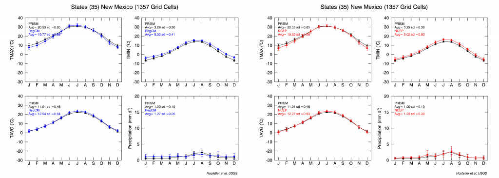
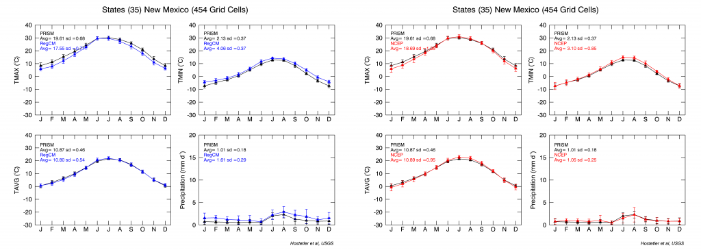
The grid cell counts in the titles indicate that New Mexico is entirely within the SRM domain (1357 grid cells) but only partially within the PSW domain (454 grid cells). Thus the averages in the diagnostic plots are over the entire state in the case of SRM whereas they are averaged over part of the state in the case of the PSW. It is important to note these differences in coverage while viewing area-averaged plots. (ENA is covered by one domain so there is no overlap.) Another aspect of the plots is that, where some smaller regions (e.g., HUC4, HUC8 or counties) fall into more than one domain, the plots can be used to determine which simulation (domain) provides the best match to observations which provides guidance for which domain to chose when downloading data. As discussed in the USGS Open-File Report differences among domains are attributable to differences along the boundary where the GCM forcing is applied to the regional model.
Monthly Climatology:
In all climatology plots, PRISM is shown in black, the RegCM3 NOAA NCEP historical simulation is shown in blue and the NOAA-NCEP regridded data are shown in red for maximum (TMAX, upper left), minimum (TMIN, upper right) and average temperature (TA, lower left) and precipitation (lower right). For consistency, we adopt the convention of the PRISM data and calculate TA for the model as the average of TMAX and TMIN, (TMAX+TMIN)/2. The averages are indicated by the symbols and the monthly variability (standard deviation) is indicated by the error bars. Annual average and standard deviation values are shown in the upper left of each plot.
For the RegCM3 shown above, the modeled annual averages over the 1357 model grid cells bounded by New Mexico are within 1°C of the PRISM for maximum and average temperature and the minimum temperature is about 2°C warmer than PRISM. The model simulates the seasonal cycle of precipitation well, but is somewhat too wet during the dry season (October – May) and too dry during the monsoon season (July – September). The RegCM3 climatology is very similar to the driving NOAA-NCEP climatology. Plots of smaller regions (e.g., counties or HUCs) will provide a more geographically explicit information about model performance, for example, over high elevations or for areas influenced by the summer monsoon.
Monthly Time Series:

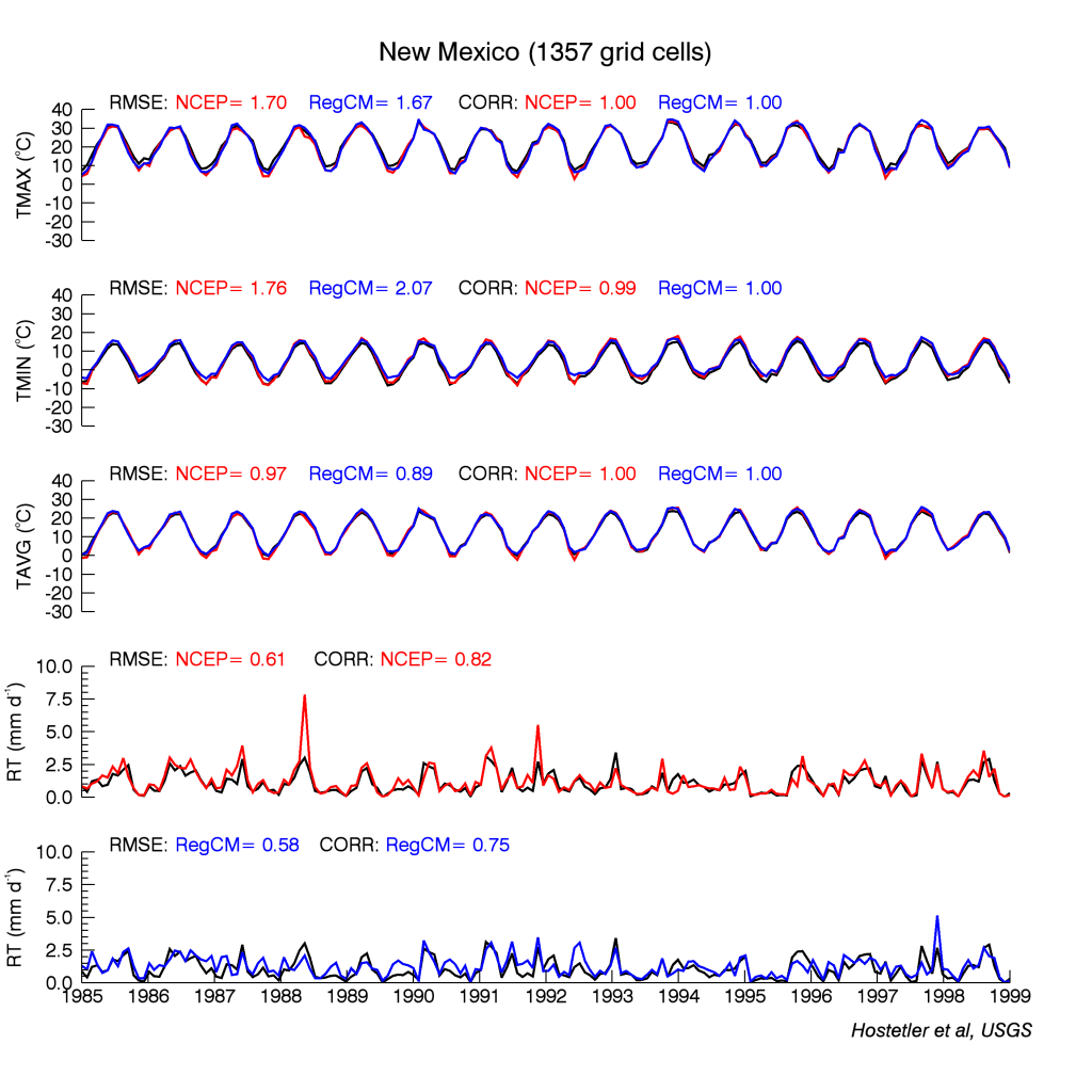
The second type model evaluation figure shown above is accessed by clicking on the Monthly Timeseries button. The time series figures are a month-by-month comparison of the RegCM3 NOAA NCEP simulation (blue), the global NOAA NCEP dataset that was used to drive the RegCM3 linearly interpolated to a 15km grid (red) and PRISM (black).
All three temperature time series are plotted in the the TMAX, TAVG and TMIN graphs. Two precipitation plots are provided because the variability in precipitation can make combined plots difficult to read. Root-mean-square error (RMSE) and correlation coefficients between the model time series and the PRISM data are shown at the top of each plot. In the example for New Mexico, the RMSE for the RegCM3 simulation is less than the interpolated version for TAVG, but greater for both TMIN and TMAX. The two precipitation time series illustrate that both the interpolated NOAA NCEP and the RegCM3 simulation compare well with PRISM. The differences in the precipitation time series illustrate both the overall consistency of the RegCM3 with the driving NOAA NCEP data and the added internal bias in the regional model.
Scatter Diagrams:
Scatter diagrams of the monthly data time series data provide and additional visual tool for evaluating the NCEP-NOAA data and the RegCM3 simulations. Scatter diagrams are available for states, counties and the HUCs.
In scatter diagrams, the NOAA-NCEP data versus the PRISM data are plotted in the top row and the RegCM3 NCEP data versus the PRISM data are plotted in the bottom row for all months included in the time series plots. If the model and PRISM data were in perfect agreement, all values would plot on the dashed 1:1 line. Departures from and spreads around the 1:1 line are visual diagnostics of seasonal and interannual model performance. In this example, it is apparent that the overall ranges and spreads of the NOAA-NCEP and RegCM3 NCEP are similar. TAMAX NOAA-NCEP has a cold bias during the cold season (1st plot in row 1), the RegCM3 has a warm bias for TMIN during the cold season (3rd plot in row 2) and the precipitation data are comparable with the RegCM3 showing slightly less spread at higher values.
Daily Time Series:
Plots of the daily time series of temperature (TA) and precipitation (RT) are available from the RCCV application for states, counties and HUCs. As is the case for the model evaluation figures, the daily time series are created from the original model domain grids. The daily time series spanning the length of the simulations are available for each of the four RegCM3 simulations. There is no comparison with observed data (PRISM is monthly) but statistical summaries are provided for basic evaluation of changes within and among the simulations. In the table at the bottom of each figure the data are summarized by quantiles that were computed from the ranked data over the indicated periods. The 95th percentile value, for example, is greater than 95% of the data (i.e., top 5%). The quantile data thus provide information about changes across the range of the data including extreme or rare events.
Continuing with the New Mexico example above, the daily temperature time series from the ECHAM5 simulation clearly shows a warming trend commencing around 2025 and that there is little, if any, change in interannual variability. The changes in temperature are quantified over 30-year periods in the table at the bottom of the page. Between 1968-1999 and 2070-2099 the coldest winter temperatures (bottom 1%) warm by 4.27°C, the median temperatures warm by 4.65°C and the highest summer temperatures (top 1%) by 5.33°C. While the median precipitation decreases by 0.22 mm/day whereas the peak precipitation (top 1%) increased by 3.79 mm/day. This implies that the region is drying in the future, but has increasing high-magnitude precipitation events. These trends in temperature and precipitation are also evident in the GMA2 and GFDL simulations suggesting they are a consistent feature of the three projections.


