The second tutorial in this series of Teaching Examples will provide a basic overview of how to assess and interpret climate changes for a county by downloading the data available from the RCCV into a spreadsheet such as Microsoft Excel or similar software. Basic understanding of the software is required. To gain the most out of this tutorial, open the RCCV in a separate tab/window to follow along with the step-by-step guide. You can do that by clicking here: Open RCCV in a new tab. If you are unfamiliar with the RCCV application or basic climatology, please read the RCCV Tutorial and begin with Climatology 101 before starting this tutorial.
Part I: The seasonal cycle
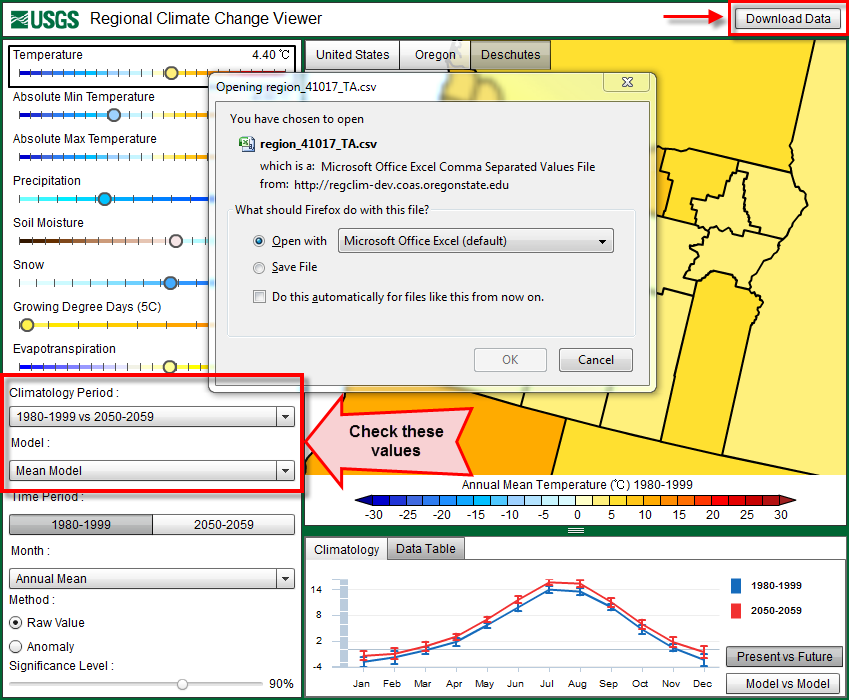
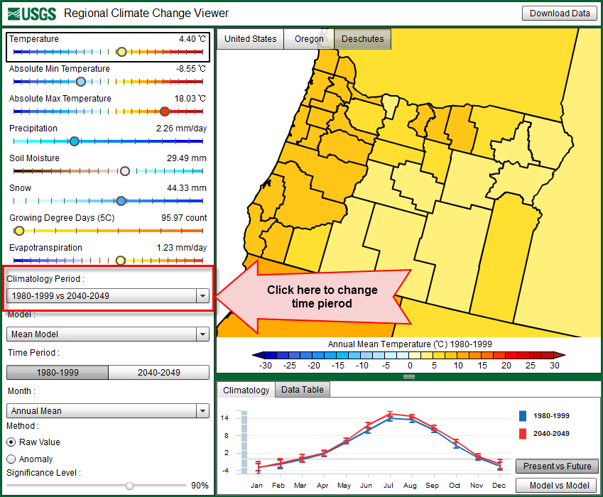
Step 1: Download the data sets
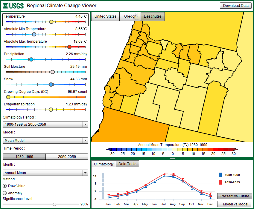
In this tutorial, we will again focus on Deschutes County, Oregon. Zoom to Oregon in the RCCV and select Deschutes County. The map should look familiar with the mean annual temperature displayed for the years 1980-1999. Make sure that the “Climatology Period” on the left panel shows “1980-1999 vs 2050-2059″ and that the “Model” displays “Mean Model”, and then click on “Download Data” in the upper right corner of the RCCV. A pop-up window will prompt you either to Open or Save the file. The data file is in comma-separated format (CSV), which is compatible with most spreadsheets. Here we use Microsoft Excel 2007 (see disclaimer).
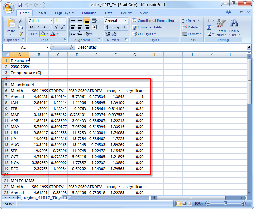
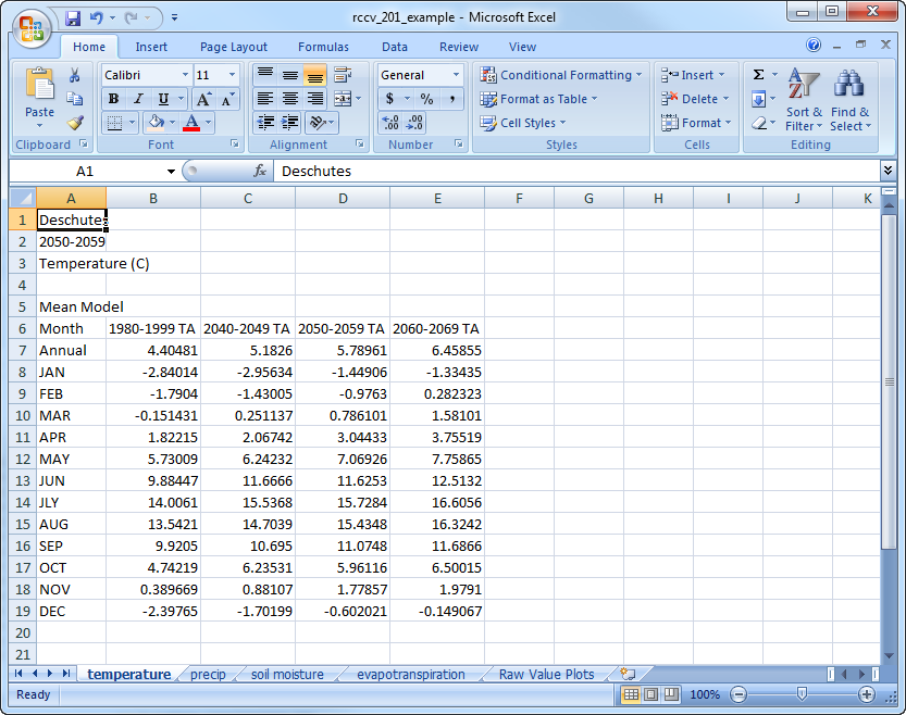
The data are organized vertically by “Mean Model” followed by data for each of the individual models below. The data available from the file download consist of the present (1980-1999) and future (2050-2059) annual and monthly average values, their standard deviations, the changes or anomalies between the two periods and the significance for the anomalies. We are still focusing on the “mean model” values, so you can delete or ignore everything except for the first section:
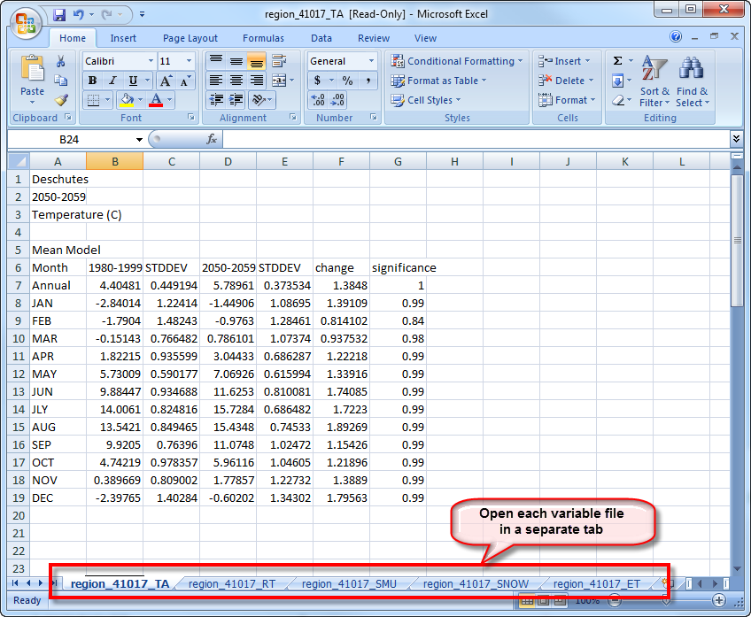
Go back to the RCCV and download the files for total precipitation (RT), upper level soil moisture (SMU), and evapotranspiration (ET). In the model, RT is the sum of precipitation derived from frontal systems and/or convection (thunderstorms), SMU is the water in the top 10 cm of the soil and ET is the combined loss of water from evaporation of moisture from non-vegetated surfaces and transpiration of plants. For the ease of working with all of the variables simultaneously, open the additional files in separate tabs in Excel. If your software does not allow multiple tabs, it is still possible to complete the tutorial as long as you are able to view each of the data files at the same time:
Step 2: Create and analyze raw value plots
In Climatology 101 we compared the changes in several variables and drew inferences among them using the RCCV. We will do the same type of analysis here using the added step of viewing each of the climatology graphs next to each other.
Create a new tab (“Insert Worksheet”) and name it “Raw Value Plots”. This new worksheet will be used to store the plots. Go back to the temperature (TA) sheet and select the months JAN through DEC, hold down the “Ctrl” key and select the corresponding values under the “change” column, and the column titles “Month”, “1980-1999″, and “2050-2059″. Insert a “Line chart” to display these data, then move the line chart to the new sheet called “Raw Value Plots”:

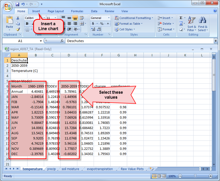
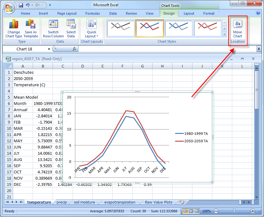
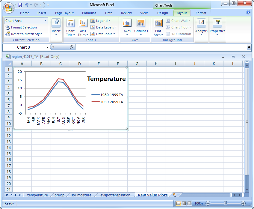
Resize the plot so it occupies approximate a quarter of the sheet, then format the plot to display axes labels and a title. The x-axis displays months of the year and the y-axis displays the temperature anomaly between the years 2050-2059 and 1980-1999 in degrees Celsius. The trend in the plot should look exactly the same as the anomaly plot displayed in the RCCV for the same values but without the error bars:
Go back and make similar plots for the precipitation (RT), soil moisture (SMU), and evapotranspiration (ET) data. Move each of these charts to the “Raw Values Plots” tab and resize to fit so we can compare all of the variables at once. You should now have a spreadsheet that looks similar to this:
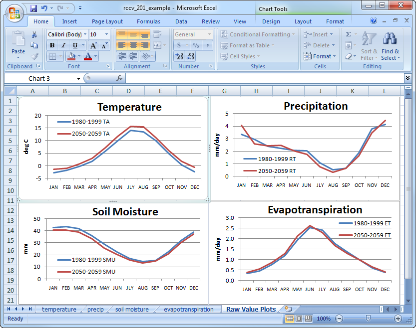
Now that all four plots are placed side-by-side, we can compare the seasonal cycles and draw inferences among the variables. The plots illustrate the Mediterranean climate of the Pacific Northwest, which is characterized by cool, wet winters and warm, dry summers. During the winter, soil moisture levels are at a maximum and evapotranspiration is at a minimum because there is very little solar radiation to provide energy for evaporation and many plants are dormant. As air temperature warms from the late spring into the summer, more energy from solar radiation is available for evaporating moisture, plants begin to transpire actively and evapotranspiration increases. During summer, air temperature and evapotranspiration are at their maxima (about 15°C and 2.5 mm/day, respectively) and precipitation and soil moisture are at their minima (about 0.5 mm/day and 15 mm, respectively). Precipitation and soil moisture reach their annual minima at about the same time in August; however, air temperature reaches its annual maximum in July and evapotranspiration reaches its annual maximum in mid-June.
These differences or lags and leads in the timing of maxima and minima reflect the interplay of the seasonal cycles of the energy and water balances. Here we use air temperature to represent the energy balance (more information on the energy and water balance). Evapotranspiration peaks in mid-June because there is sufficient water stored in the soil from winter and spring precipitation, there is still some precipitation occurring and solar radiation reaches an annual maximum around the time of the summer solstice (between June 20 and June 21). (Air temperature continues to rise and stay high in July and August because there is a lag and persistence in the warming of the Northern Hemisphere relative to the solar radiation maximum.) After the solar radiation peak in June, available soil moisture decreases due to the steep decline in precipitation and the depletion of moisture from transpiration that occurred earlier in the summer. Precipitation reaches a minimum in August after which it increases to replenish soil moisture. At the same time, air temperature (solar radiation) and plant transpiration are declining causing ET to decrease.
Part II: Compare seasonal averages
We will now look at the changes in variables between several decades to view trends over the long-term seasonal averages. Data are not available for all decades for all of the models, which can bias the “mean model” values when comparing the values and trends. We will focus on the decades for which we have data from all three climate simulations: 2040-2049, 2050-2059, and 2060-2069. We will explore model-to-model differences in more depth in Climatology 301.
We already have the data files for temperature, precipitation, soil moisture, and evapotranspiration for 2050-2059. Return to the RCCV and download additional files for temperature, precipitation, soil moisture, and evapotranspiration for 2040-2049 and 2060-2069. To do this, change the time periods under “Climatology Period”, choose the variable you want to download, then click on “Download Data” in the upper right corner.
Copy and paste the new data sets for each variable into the existing spreadsheets. We will not be using the “STDDEV”, “change”, or “significance” columns at this time, so these can be deleted. Your spreadsheet should now look something like this, with four decades of data for each variable:
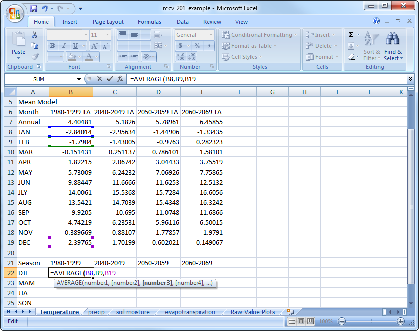
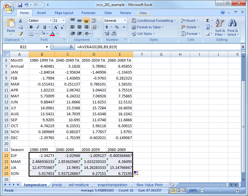
Now we will calculate the seasonal averages for each decade and variable. Create a new table below the data and use the “AVERAGE” function in Excel to calculate the three-month mean for each season. The abbreviations for the seasons are DJF (December, January February), MAM (March, April, May), JJA (June, July, August), and SON (September, October, November). In the first cell under 1980-1999 for DJF, type “=AVERAGE(” then select the corresponding values for JAN, FEB, and DEC while holding the “Ctrl” key down in between selections, and hit “Enter” to perform the calculation:
Do this calculation for each season in the 1980-1999 decade. To save time calculating the values for each decade, highlight the number for each season in 1980-1999, then drag the black square in the lower right across for the remaining columns:
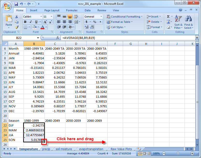
The final data table values should match these:
Create a new worksheet to contain the four plots, as we did in the previous example. Highlight the entire seasonal value data table, including column and row headings, and insert a 2-D Clustered Column Chart. Move this chart to the new sheet:
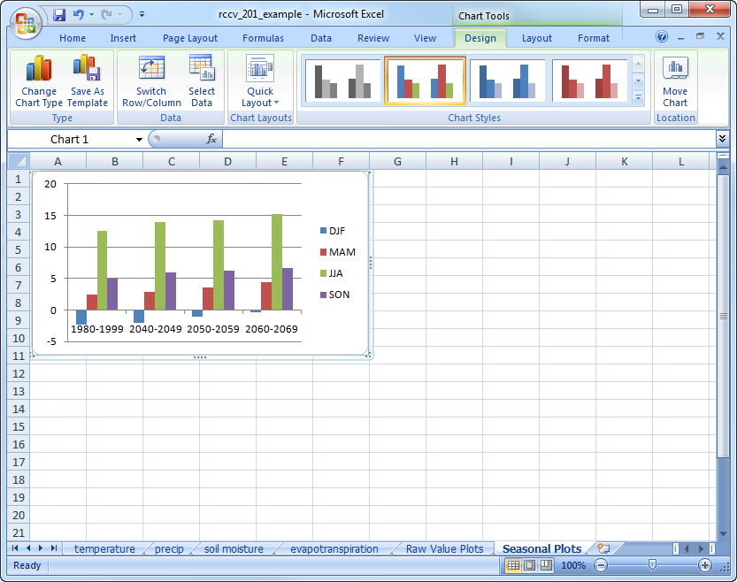
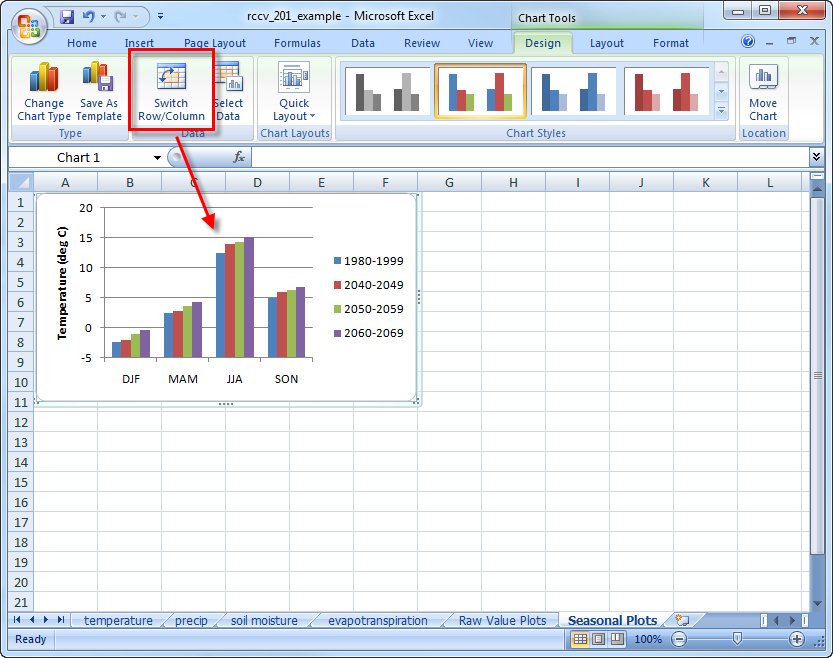
Notice how the columns are organized by decade and each season is a different color. This type of organization is informative, but makes it somewhat difficult to compare how seasonal values might be changing through time. Select the plot and click on “Switch Row/Column” to organize the columns by season:
Calculate the seasonal values for precipitation, soil moisture, and evapotranspiration. To make this process faster, make sure each of the other data sheets is formatted exactly the same as temperature, then copy and paste the seasonal data table in the exact location on the other spreadsheets. The values for the other variables will then be calculated automatically. Create the plots for precipitation, soil moisture, and evapotranspiration and place them in the graph spreadsheet so you have seasonal averages for all four variables and all four decades displayed together:
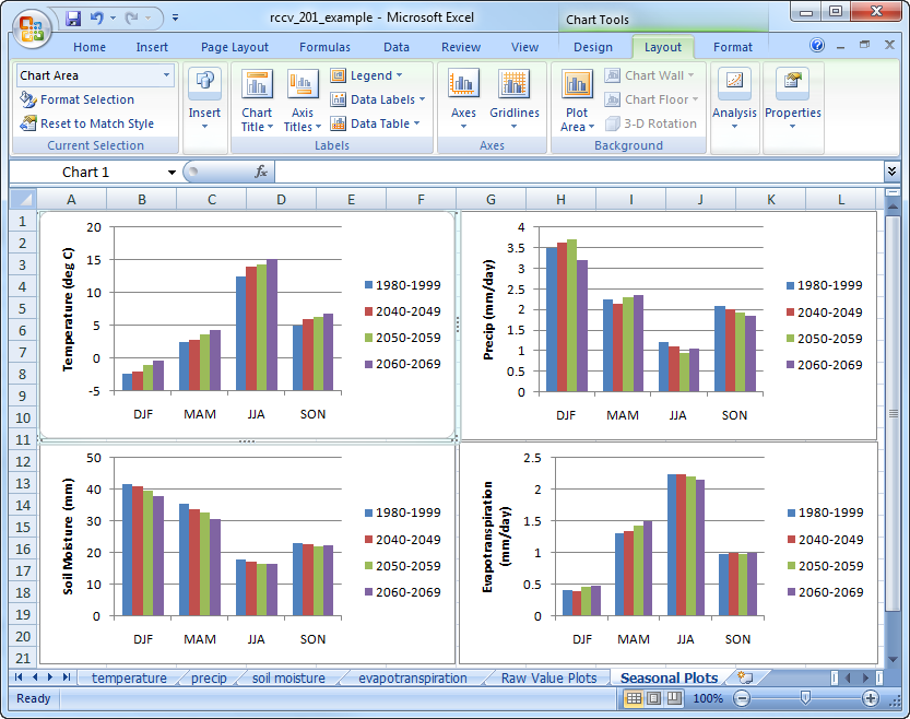
The graphs now illustrate the changes and trends in the seasonal averages for the base period (1980-1999) and the three future decades. The evolution of the seasonal cycle in the graphs is the same as that of the previous example, although the decadal changes and trends within the seasons are slightly less obvious. It is easy to see that air temperature increases for each season for each successive decade into the future; however, the amount of warming varies both within the seasons and among the decades. Changes in precipitation by season and decade are also evident, but there is no apparent directional trend as there is with air temperature. You can evaluate the statistical significance of the changes by going back to Deschutes County in the RCCV and looking at the significance values for the Mean Model in the data table for each variable. The variability in the rate and seasonal distribution of simulated temperature and precipitation demonstrates that future climate change will probably not be uniform across regions, seasons and decades.
Identifying correlations between evapotranspiration and the other variables is slightly more difficult due to the complex relationships between these variables. There is no consistent seasonal trend in evapotranspiration as there is in the temperature data. The amount of ET in a time period depends on the amount of available energy, the available moisture and the transpiration rate of plants. The amount of energy is a function of the season and cloud cover and available moisture depends on precipitation and the water in the snowpack that recharges soil moisture. Transpiration is also controlled by the amount of soil moisture and energy available for photosynthesis. In general, transpiration increases with air temperature. Thus, the complex nature of processes that control evapotranspiration make inferring specific relationships on the seasonal scale difficult.
For the last exercise in this tutorial, create a seasonal average plot for snow water equivalent (SWE), just like those for the other variables. Put this plot on a new tab and copy over the seasonal temperature and precipitation plots:
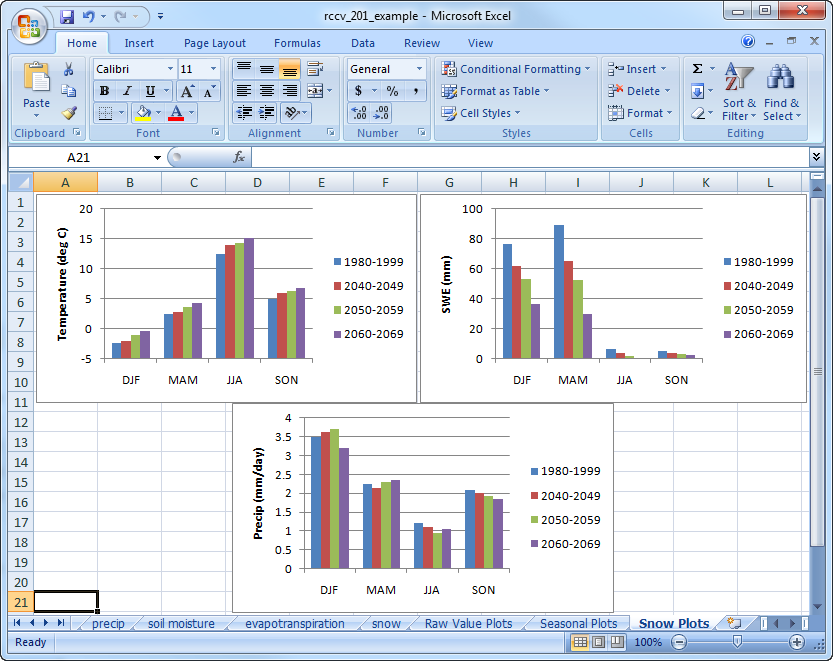
The simulated decade-to-decade decline in average winter and spring SWE for Deschutes County are large and unidirectional for all seasons and decades (check the statistical significance of the changes in the RCCV data table). The biggest changes occur during the spring (MAM) when SWE reaches an annual maximum. The changes in SWE mirror the warming trend in air temperature but appear somewhat unrelated to changes in precipitation. Even though winter and spring precipitation increases during some decades, SWE declines because with the accompanying warmer temperatures more precipitation falls as rain instead of snow and the snowpack melts earlier in the year. The simulated changes in SWE presented here are consistent with observations from Western North America over the last few decades.
The next tutorial will explore the differences between the models and how each model simulates unique climate changes in the future.