
This third tutorial in the series of Teaching Examples provides a basic overview of how to assess and interpret climate changes for different climate models. As is the case with the previous tutorials, we will use data available from the RCCV in a spreadsheet such as Microsoft Excel or similar software. We will also make use of some of the more advanced features of the RCCV to look at model variability. To gain the most out of this tutorial, open the RCCV in a separate tab/window to follow along with the step-by-step guide. You can do that by clicking here: Open RCCV in a new tab. If you are unfamiliar with the RCCV application or basic climatology, please read the RCCV Tutorial and begin with Climatology 101 and Climatology 201 before starting this tutorial.
Step 1: How are the models different?
We will continue to focus on Deschutes County, Oregon as we did in Climatology 101 and Climatology 201. We have been focusing on the “Mean Model” data, which is simply the average of the three climate models (MPI ECHAM5, USGS GENMOM, and GFDL CM2.0). In this tutorial we will look at the models individually with regard to how they simulate the present climate and how they differ in their simulations of the future. All three models show increasing temperature and decreasing snow pack in the 21st century, but how much warming and how much snow pack is lost, the seasonal timing of the changes and the geographic distribution of the changes vary among the models. Moreover, although the models simulate generally similar seasonal cycles of precipitation, they differ in the details of the monthly values both in the present and future. By averaging the three models together, we minimize model-to-model differences, which is both appropriate and desirable for many applications. But averaging can obscure model-specific details that could be important for assessing the plausible range of change and gaining interesting insights into the nature of change.
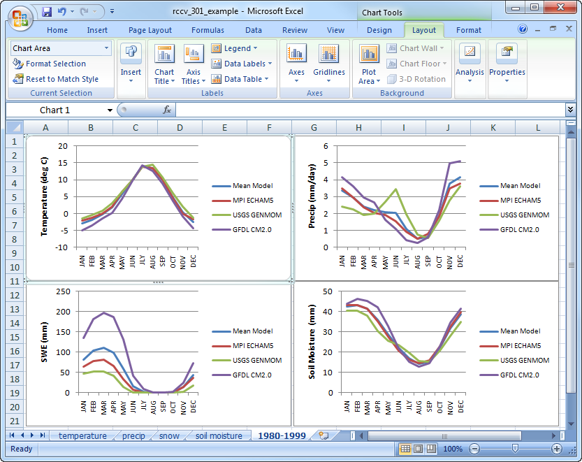
Download the data files for temperature, precipitation, soil moisture, and snow for the Climatology Period 1980-1999 from the RCCV. Do not delete any of the values on the spreadsheets (except the “significance” column), as these data will be used later in this example. Create separate line plots for each variable for the 1980-1999 data using the values for “Mean Model” and each individual model (MPI ECHAM5, USGS GENMOM, and GFDL CM2.0). Place the plots on a new worksheet:
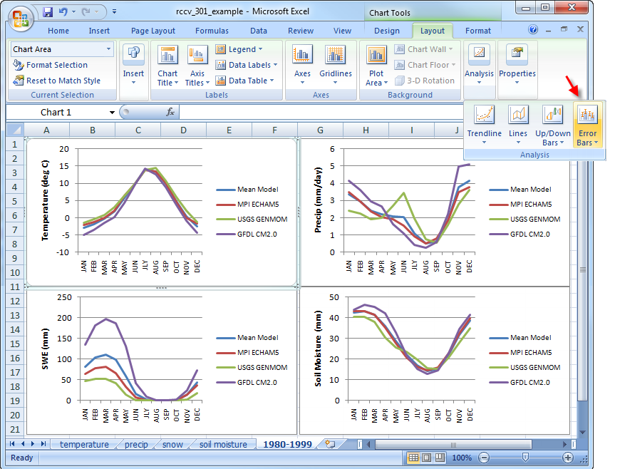
We will now add standard deviation or error bars to these plots like those on the climatology graphs in the RCCV. Error bars give a sense for how variable or uncertain the monthly average climate is over the ten-year averaging period. In Excel, click on “Layout” under the “Chart” menu at the top, then go to “Analysis” > “Error Bars” and click on “More Error Bars Options”:
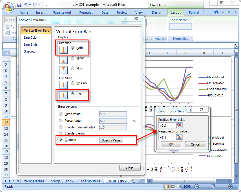
Add error bars for each of the four lines on the temperature and precipitation plots (we will focus on SWE later in the tutorial). In the options menu, you can customize how the error bars appear on the plots. We want to display the bar in “Both” directions and with a “Cap” end style. Because we already have the standard deviation in the downloaded file, add a “Custom Error Amount” and select the appropriate standard deviations for both the positive and negative error values. The bar colors can also be formatted to match the line plots before exiting the “Format Error Bars” menu:
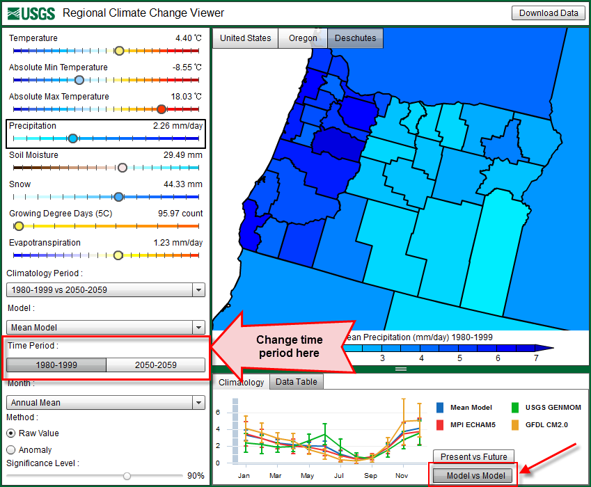
The final plots shown above should look identical to those on the RCCV web application. To check this, change the Climatology Graph at the bottom on the RCCV to display the “Model vs Model” values and make sure the “Time Period” displays “1980-1999″. You can change the variables on the left to make sure the plots look similar:
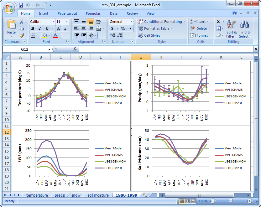
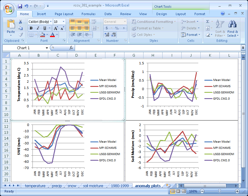
In the Excel plots, you can see that, as a group, the models produce very similar seasonal cycles of temperature, precipitation, soil moisture and SWE for Deschutes County. But it is also apparent that individually, the models produce average monthly values and variability that differ. For example, compared to the other two models, the USGS GENMOM model produces higher precipitation rates in the late spring and early summer and lower precipitation rates in the winter months. GFDL CM2.0 produces high values of SWE in the late winter and early spring, because it is colder and wetter than the other two models during those seasons.
The temperature plot indicates good agreement among the models; the monthly means are similar and the standard deviations are relatively small. The months where there is the most disparity among the models in the precipitation and SWE plots also tend to display some of the largest standard deviations or uncertainties. Large standard deviations indicate that over the averaging period the model produced a relatively wide range of 10 monthly values. With only ten values comprising the average, uncertainties can be influenced by a few unusual years.
The uncertainty displayed in the simulations is a combination of the natural variability of the climate system and the internal variability of the models. In general, air temperature is naturally less variable than precipitation and thus SWE. The model-dependent variability in the simulations is in part associated with how physical processes, such as thunderstorms, are represented in the regional model. Additional variability is attributable to variability in the global climate models and simulations that were used to drive regional simulations. Additional information about the models may be found on the RegCM3 and BATS Description and Overview of GCMs pages.
Overlap of the error bars on the plots provides a visual indication of the similarities and differences of the simulations. Error bars from one model that overlap or bracket the monthly average value of another suggest that statistically the average monthly values for both models are the same. Conversely, if the error bars do not bracket the mean, the average value produced by one model is statistically different from that of the other model. Interpreting the error bars in this way applies not only in the context of evaluating how similar the models are for a common period (e.g. 1980-1999) but also in the context of evaluating how different the simulations of future climate are for a given model (e.g., 1980-1999 versus 2050-2059). In the latter case, non-bracketing error bars indicate that the future climate is statistically different from the present climate.
Step 2: Different models give different results
In climate change research, the magnitude of a change simulated by climate models is often of more interest than the raw values for the present and future. As we discuss in the background material and in the Open-File Report (2011-1238), if a model simulation of the present climate is warmer (colder) or drier (wetter) than the real-world observed data, the model is biased. All climate models exhibit some degree of bias because complex physical processes and interactions are necessarily simplified in the numerical model computer codes (Overview of GCMs). Relying on the magnitude of the changes (anomalies) between present and past or the present and future eliminates the bias inherent to a particular model. Here we will look at both changes in the mean and changes in the amount of variability. We investigate how to correct for bias in Climatology 401 and 501.
The following figure includes plots of the 2050-2059 vs 1980-1999 anomalies (the “change” column in the CSV data files) for temperature, precipitation, SWE and soil moisture:
The overall trends in the anomalies are broadly similar. For example, the air temperatures produced by all three models are warmer in all months and the seasonal patterns of the positive and negative precipitation anomalies are comparable. Clearly, however, the models do not agree on the future changes as well as they agree for the 1980-1999 climatologies.
Inspecting the models individually, instead of the mean-model average gives us insight into possible details of the future climate of Deschutes County. In the figure above, all the models simulate reduced SWE in 2050-2059; however, the GFDL CM2.0 simulation indicates a reduction in snow three times that of USGS GENMOM. The MPI ECHAM5 simulation falls in between GFDL and GENMOM and very close to the Mean Model plot. A large part of the GFDL reduction is due to the amount of snow in the simulation of the 1980-1999 which is attributable to the fall-through-spring cold temperature bias. The GFDL CM2.0 anomalies also display an overall larger change in temperature than either USGS GENMOM or MPI ECHAM5, with winter substantial warming which reduces SWE in the future.
All of the models simulate a net loss of moisture over the seasonal cycle that is attributable to reduced precipitation, warmer temperatures and loss of SWE. GFDL CM2.0 has a strong late spring-early summer drying whereas MPI ECHAM5 has a strong drying during the winter and early spring. USGS GENMOM anomalies do not display any strong seasonal changes. In the Mean Model plot, the timing and magnitude of the large seasonal changes in GFDL CM2.0 and MPI ECHAM5 are averaged out, so the mean model plot has moderate year‑round drying with marginally more drying in winter and spring.
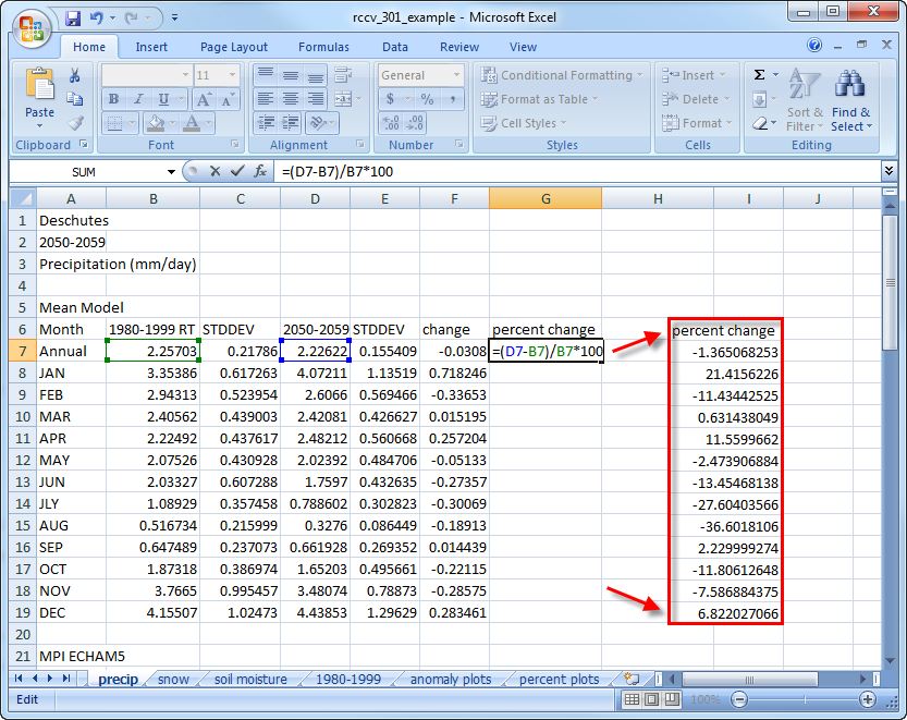
Calculating and plotting the 2050-2059 vs 1980-1999 differences as percent change gives us an additional way to interpret the data. Insert the equation for calculating the percent change in the precip spreadsheet in the Annual row and drag the handle in the cell down to copy it and calculate the changes for monthly values:
Calculate the percent change for snow and soil moisture, plot the changes and copy the plots to a new spreadsheet:
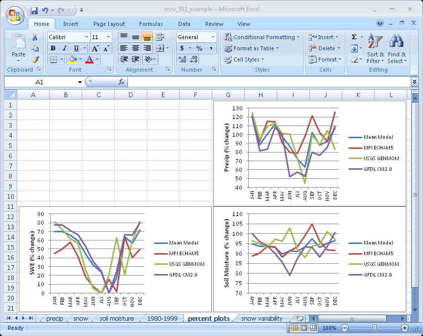
We did not calculate the percent change for temperature because evaluating changes in temperature as a percent warmer or colder has little meaning. The interpretation of the percent changes is the same as it is for the absolute values discussed above. Except for summer, the percent change in precipitation is relatively modest in all models. The large changes in summer are the result of small changes in small numbers (check the values in the spreadsheet) and need to be viewed in the context of the other seasons. As we discussed previously, GFDL CM2.0 has a very large absolute wintertime change in SWE relative to the other models because the model overestimates SWE for both the present and the future relative to the than the other two models. In terms of percent change, however, GFDL CM2.0 displays a 20-30% reduction in wintertime SWE, which is similar to the 20-40% reduction in USGS GENMOM. MPI ECHAM5 has the largest percent change in wintertime SWE with a 40-55% reduction, but in terms of relative change, the models are comparable.
So far, we have focused on the temporal aspects of the simulations of future climate for Deschutes County. Another important aspect of model-to-model variability is how the models compare spatially. The following three figures display the Deschutes County SWE anomalies for March in the context of all Oregon counties:
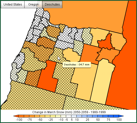
MPI ECHAM5:
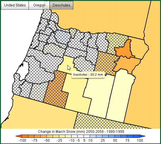
USGS GENMOM:
GFDL CM2.0:
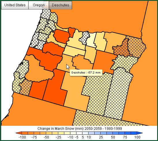
All models display a general pattern of reduced SWE in March over central and eastern Oregon. Little or no change is indicated in most western Oregon counties that receive very limited snow except for the counties that include high elevation areas. The 2050-2059 loss of SWE in Deschutes County is consistent with state-wide losses. GFDL CM2.0 clearly exhibits the largest statewide reduction in March SWE, in agreement with our findings for Deschutes County. USGS GENMOM has a relatively small March reduction in SWE and MPI ECHAM5 reductions fall between GFDL and GENMOM. The number of non-hatched counties where changes in SWE are statistically significant (here, at the 90% level) varies both by the magnitude of the change and by model. In the western part of the state, changes are not significant again because snow is so limited. The Deschutes County SWE anomaly from MPI ECHAM5 simulation is large compared to either of the other models yet it is not significant due to the wide range of uncertainty. Comparing the model results spatially once again underscores the value of using individual model results to inform interpretations of the average of the models.
Step 3: Changes in variability
In addition to changes in the average climate, an important and associated issue is change in variability. For example, will droughts, extreme precipitation events, and heat and cold waves be more frequent and/or of greater magnitude? Answering these questions fully requires analyses beyond our scope here, but we can use the available data from the RCCV to gain some insight into changes in variability.
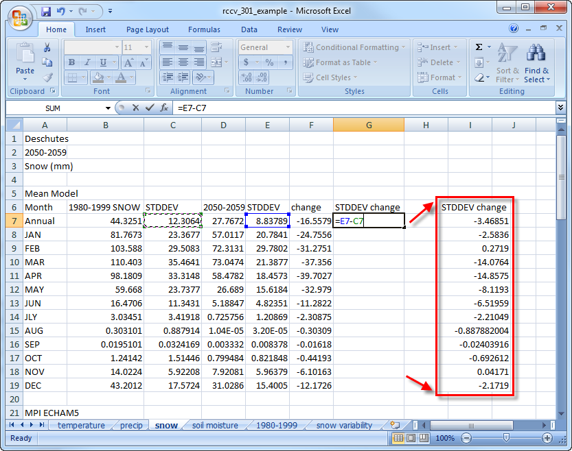
The downloaded files from the RCCV application contain columns of numbers for both the present and future means and standard deviations. For each model, calculate the absolute changes in the standard deviation between the present and future time periods for SWE and plot them:
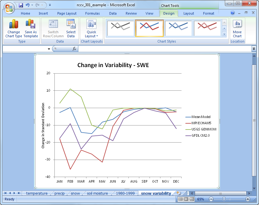
In the above plot positive values indicate that the future standard deviation is greater than present, so the simulated monthly average SWE in the future is more variable. Negative values indicate that SWE is less variable in the future. Overall the anomalies show that GENMOM is the only model with more variable snow in the future; the other models and the mean model are less variable. There is little to no change in variability during the summer months because, as is the case in nature, the only snow remaining in Deschutes during the summer is over the highest elevations, which represent a relatively small area.
The next two tutorials, Climatology 401 and Climatology 501, are considered advanced topics and will move out from Excel and use computer programming to calculate the long term annual temperature time series for a county and learn how to correct for model bias.